Social media has given us a whole new way to think about our walls as photo backdrops and the desire for instagram worthy home decor. The pandemic and Zoom calls made this thinking even more urgent as we turned away from wall colours that did nothing for our skin tone and looked like a 'proof of life' videos rather than your winning self.
Key to achieving the perfect backdrop and swoon worthy rooms is not just the colour, but the paint itself. The depth of colour in your paint is achieved with premium quality, expertly balanced pigments, tested in a variety of different lights; hence why we trust the new Annie Sloan Wall Paint to bring these trending colours to life with a velvety luxurious finish.
Here are 5 colours we see all over Instagram:
#1 Terracotta and Earthy Pinks

Terracotta and Earthy Pinks are trending and are sometimes used in the same rooms because they achieve a warm flattering boho chic vibe. They are inviting colours and can add an instant update to any environment. We started to see these colours come in with pottery, rugs and now walls.
Riad Terracotta by Annie Sloan is a spicy, burnished orange like the warm terracotta tones used in Marrakesh, Morocco.
Another favourite is Piranesi Pink. Its almost flesh coloured and suggestive of setting plaster. It's timeless and universally complimentary. They can create a beautiful scheme with jute rugs, plaster vases and soft linen furniture.

#2 Green in all its glorious shades

Green has been a trending colour lately but its become more refined. Soft greens are paired with earthy pinks, and deep green has taken over cabinetry in a big way.
Annie Sloan has a beautiful array of greens; from the relaxing Cotswold Green to cool grey green of Terre Verte. Terre Verte is a best seller as it has enough white in it to be a neutral and works with every scheme.
When it comes to cabinetry its all about Knightsbridge Green which is a rich, smart and stately green. It's also perfect for a cabinet makeover as it comes in the Satin finish which goes on furniture or cabinets without the use of wax or lacquer.

# 3 Lovely Lavendar
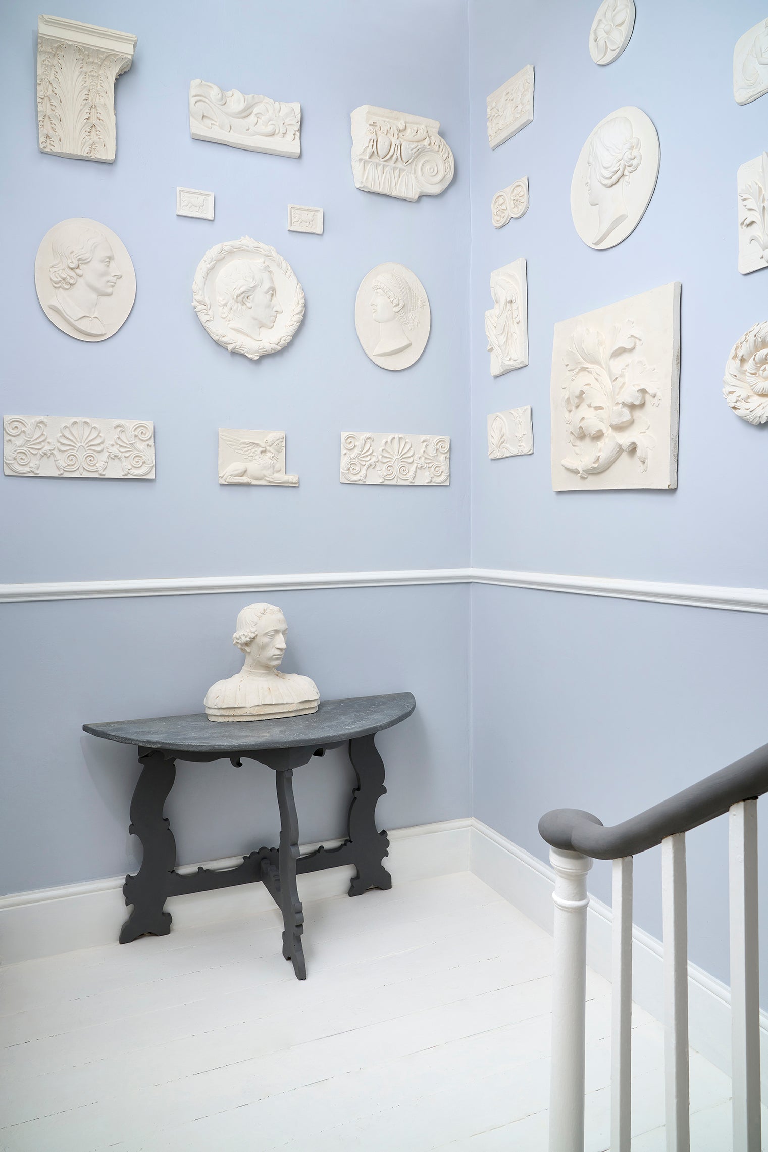
Lavender is forecasted to be the colour of the year in 2023, but its not the cloying pastel you're thinking of. It operates more as a neutral with hint of warmth. It softens a grey and reflects the light to makes you look and feel good without ever reading too purple.
Annie Sloan paint offers Paled Mallow which is a cool, softly tinted purple-white neutral, sitting directly between grey and blue. A pastellised colour in the tradition of the light reflecting grey hues used in grand 19th Century interiors.
In chalk paint if you want a hint just on furniture and not ready for your walls, try Paloma. Its beautiful on bedroom side tables. It reads both grey and lavender without being too much of either.
#4 Bright White
Sometimes you just need to have a crisp peaceful environment at the end of the day and a bright white fits the bill. Bright white is also super adaptable, perfect for a traditional or modern interior and symbolizes new beginnings.
However, whites can be tricky. To avoid going wrong try Pure White formulated by Annie Sloan. It is the right tone without the grey or cream that can underlay some whites. It offers the perfect backdrop to art work and soft textiles, works in both sunny and north facing rooms - just a perfect white. Pure White comes in chalk, wall and satin paint so it works with practically every surface in your home.
#5 Electric Blue
This colour is seen on everything from shoes to clothes to home decor. Maybe its because it pairs so well with our first colour, Terracotta, or maybe its just a pop of happy that people love.
Terracotta and blue may seem like an unlikely pairing but they are complementary colours so they balance each other and please the eye. If you have painted your walls in blue, don't always look for white accessories. Try adding in a terracotta rug or throw pillows for a warm vibe.
Electric Blue may signal an 80's vibe to some, but its been around long before that in modern art and home decor (think Mondrian paintings). Depending on what you are pairing it with it can either restful or dramatic; it reads more tranquil teamed with a deep earthy orange or more dramatic centre stage with a full room bathed in it.
Napoleonic Blue by Annie Sloan is a strong blue that is the right tone for this trend and is balanced with a deep richness.


There you have it! Our run down on the five paint colours we see everywhere on Instagram. So whether you are looking for a great Zoom back drop or want to bring some of the newest paint trends into your home, you won't go wrong with any of these gorgeous shades!
Happy posting and painting!